Maitaporá E-Commerce
Web & App Design
2024
UX UI Designer
Case Study
1.Discovery
Our Role
This was a collaborative UX/UI design project focused on creating a seamless and visually appealing e-commerce platform for Maitaporá, a florist based in El Salvador. The team, composed of Clarissa Govoni, Thai Kreise, and Andrea Melo, worked on user research, wireframing, prototyping, and visual design to address client challenges and enhance user experience.
Tools Used
Figma: Wireframing, prototyping, and design.
FigJam: Collaborative brainstorming and affinity mapping.
Balsamiq: Creating low-fidelity wireframes.
Zoom: Virtual team meetings and user interviews.
About Maitaporá
Maitaporá is a boutique flower shop in El Salvador that currently handles orders through Instagram and WhatsApp. The client sought to expand their reach through an e-commerce platform that simplifies ordering, improves delivery logistics, and enhances customer communication.
Stakeholder Interviews
To align with the client’s vision, we conducted stakeholder interviews, preparing in advance with key assumptions about potential challenges. These included:
Manual order management causing delays.
Customers struggling with customization options.
Delivery logistics requiring better tracking solutions.

Key Insights
Automated Orders: Transition from manual to online ordering.
Customizable Products: Enable bouquet personalization.
Enhanced Delivery Logistics: Real-time tracking updates.
Multiple Payment Options: Catering to local and international customers.
Real-Time Chat Support: Improving communication efficiency.
Competitor Analysis
We analyzed Montse, Celiflor, and Faith, identifying areas where Maitaporá could stand out:

Feature Gaps: Competitors lacked bouquet customization and order tracking.
Visual Identity: Opportunity for a fresh, modern design.
Market Positioning: Positioning Maitaporá as an affordable yet innovative option.
User Interviews
Interviews with potential users helped us understand their needs and pain points:
Purchase frequency: Mostly for special occasions.
Preferences: Online shopping convenience.
Frustrations: Lack of customization, limited payment methods, and poor communication.
Additional needs: Interest in complementary gift options and a personalized shopping experience.

2.Define
Affinity Diagram
Using affinity mapping, we identified key pain points and needs:
Order Tracking: Real-time updates desired.
Communication: Faster, more efficient customer service.
Payment Options: Frustration with limitations.
Product Reviews: Demand for real photos and testimonials.
Customization: Strong interest in bouquet personalization.

User Persona
Meet Maria Clara, a busy professional who values convenience and quality when purchasing flowers. By introducing a persona name and brief storytelling, we made her more relatable:
Goals: Quick, hassle-free shopping with quality assurance.
Pain Points:
Confusing Instagram catalog.
Manual ordering process.
Limited payment flexibility.
No delivery tracking.

User Journey

3.Ideate
Sketching & Ideation Techniques
We used Crazy 8s and brainstorming workshops to generate ideas, followed by sketching to visualize potential solutions.
How Might We (HMW) Questions
These guided our ideation:
How might we make the ordering process seamless?
How might we improve delivery tracking?
How might we ensure a personalized shopping experience?
MoSCoW Prioritization & MVP
The MVP included an intuitive shopping experience with:
Automated order tracking
Customizable bouquets
Multiple payment methods
Real-time chat support
Site Map
A structured, user-friendly navigation system was designed to ensure easy exploration and conversion optimization.


Wireframes
Low-Fidelity Wireframes
Initial designs focused on structure, refined after user testing:

Replaced cart icon with a basket.
Moved contact section to the footer.
Added a gift selection feature.
Mid-Fidelity Wireframes
Introduced filter options for gift sets.
Added seasonal promotions.

4.UI Design
Visual Competitive Analysis
Competitor research informed a unique aesthetic balancing modern elegance and functionality.
Brand Attributes & Style Guide
Defined attributes: Modern, Sophisticated, Natural, and Charming.
Color Palette: Lilac and green for serenity and vitality.
Typography: Montserrat & Cabin for elegance and readability.
Moodboard: Refined textures and organic elements for a cohesive identity.


High-Fidelity Prototypes
Detailed designs refined based on user testing, including:
Enhanced color contrast for improved readability.
Optimized spacing for clarity.
5.Validate
User Testing & Iterations
We conducted usability tests, incorporating feedback through before & after comparison images:
Users found the initial color scheme too dull → Adjusted for vibrancy.
Navigation clarity improved based on feedback.
Desirability Testing
Assessed emotional perception:
Users rated the design as modern and inviting.
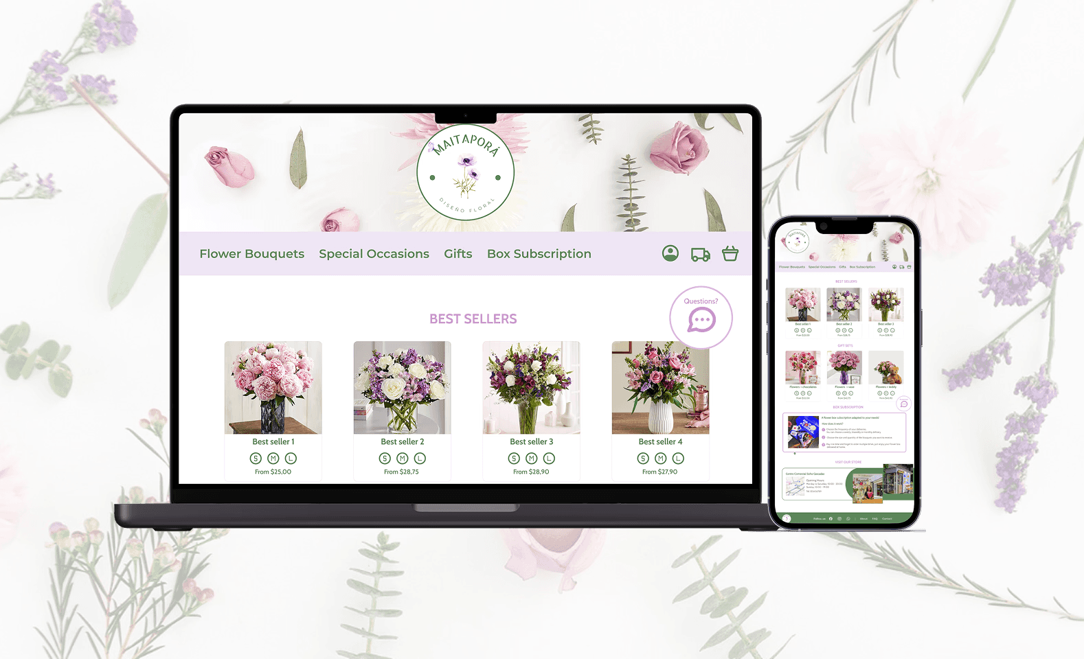
Responsive Design
Ensured usability across devices by implementing adaptive layouts and optimized interactions.
What We Learned
The importance of clear stakeholder communication.
How to balance aesthetics with usability.
Iterative testing leads to impactful refinements.
What We Would Do Differently
Incorporate usability testing earlier to iterate faster.
Expand user research to capture broader demographics.
Final Thoughts
The Maitaporá e-commerce platform successfully addressed the initial challenges, providing a seamless, intuitive, and visually appealing solution that enhances the online flower shopping experience.