Redesigning Evernote: A UI Challenge to Improve User Experience
A UI Challenge to Improve User Experience
2024
UX UI Designer
Case Study
Introduction
Improving UI skills through design challenges is a common practice in the design community. Many websites offer random UI challenge generators, but for this project, I decided to take on a more structured challenge: redesigning a well-known native mobile app.
This project was part of my learning journey in the Ironhack UX/UI Bootcamp. The goal was to analyze an existing app, conduct a design audit, and propose a new version with visual and usability improvements.
For this exercise, I chose Evernote, one of the most popular productivity apps for note-taking, task management, and information storage. My aim was to optimize its interface while maintaining its essence, improving key aspects such as visual hierarchy, accessibility, and overall aesthetics.
Discovery: Heuristic Analysis of Evernote
Before redesigning, I conducted a heuristic analysis to identify areas for improvement in the original app:
Loading screen: Minimalist design with a well-positioned logo. However, the lack of feedback may create uncertainty for users.
Suggestion: Add a progress bar or loading animation.
Home screen: Too much information about tasks, making it difficult to identify the primary action.
Suggestion: Highlight the "Create New Note" action above others.Search functionality: No direct access to recent files, which slows down navigation.
Suggestion: Add a "Recent Files" category for faster searches.

Define: Redesign Goals
After identifying areas for improvement, I set the following objectives for my redesign:
Enhance visual hierarchy: Make the most important actions stand out.
Optimize navigation experience: Reorganize key elements like the search bar.
Update the visual aesthetic: Modernize the interface while preserving brand identity.
Ideate: Design Exploration & References
For inspiration, I analyzed apps with clean interfaces and dark backgrounds—an aesthetic that improves readability and gives a modern touch. Some key references included:
Notion – For its organized structure and minimalist approach.
Apple Notes – For its simple and intuitive navigation.
Todoist – For its effective task management system.
UI Design: Evernote Redesign

Based on my analysis and references, I implemented the following UI improvements:
Loading Screen
🔹 Kept the original logo but added a loading animation to enhance user experience.
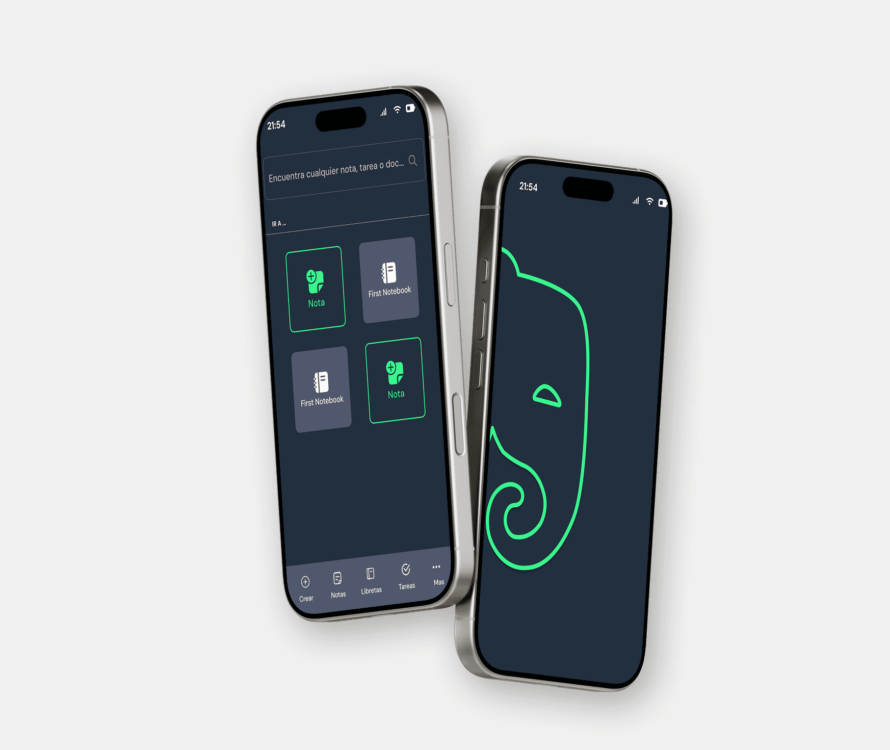
Home Screen
🔹 Enlarged the logo to reinforce brand identity.
🔹 Highlighted the "Create New Note" action, making it visually distinct.
🔹 Moved the search bar to the bottom for easier access.
Main Notes Screen
🔹 Introduced a new color palette: dark blue background with white text for high contrast.
🔹 Kept Evernote’s signature green but intensified its brightness for interactive elements.
Search Functionality
🔹 Replaced the search bar with categorized icons: "Recent Files" and "Recent Notes."
🔹 Adjusted the visual organization to improve navigation.
Validate: Reflections & Key Learnings
This project allowed me to strengthen my UI design skills, particularly in:
Using Auto Layout to maintain consistency in spacing and alignment.
Improving accessibility through contrast and visual hierarchy.
Applying heuristic principles to enhance usability without extensive UX research.
- What could be improved?
- Conduct more user testing to validate design decisions.
- Experiment with micro-interactions to improve navigation flow.

Conclusion
This exercise was a great challenge that allowed me to explore my creativity and refine my UI skills. The Evernote redesign is just a starting point, but it motivates me to keep learning and improving my design process.